You can go to the Pantone website and check out all kinds of great color stuff.
I am always thinking about color.

Bubbling UP
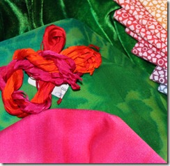
Emerald is working in lots of my work.


Hidden World – detail

Prairie Grass
How have you used “Emerald” in your work?


Talky talky talky – words always come out of my mouth mangled. I wonder if I have a disconnect in my brain. BUT images stay there a long time. I try to connect an image with a word when I really need or want to remember it.
Here are some of the words used for color.
Hue – That is just another name for color; red, yellow, green, orange etc.…
Tint – Color +WHITE while pink is a color all it’s own it is a tint of red a lighter version.
Tone – Color +Black, I add black to my hand dyes to create what I call blackened colors.
This is my Blackened Rainbow gradation.
Key color - Dominant color in a color scheme or mixture
Neutral – Grey a combination of black and white, or any color that is non descript.
I like to call Frieda Green a neutral and I find it often works that way for me.
Intensity or Chroma - the brightness or dullness of a color
Rainbow Gradation are all bright colors, there are 14 bright full strength colors in this gradation.
Value - the lightness or darkness of a color
The values in Winter Sky go from black to light grey.
You can keep these words in your brain and associate the pictures I have provided.
Have a great weekend.
I found a really fun and I think useful new website. When I say new I mean new to me.
Go to Color Scheme Designer three and check it out. I had a ball just moving the little dots around inside the color wheel and looking at the color schemes change on the right side of the page. I will definitely go back again and again and use this site. I hope you do to.
This site lets you play with color just like you would with a color wheel only more so. The site illustrates well the principals I was talking about yesterday and in an interactive creatively fun way.
Color is like chocolate, you just have to have it.
It’s one of the reason I enjoy hand dying my own fabrics, to get rich yummy color.
I love working in COLOR, it always makes me happier, I don’t know about you but for me, living here in the mid-west where winter is long and cold and grey and dreary, it really helps to play and work with bright things.
When I am teaching I hear the students say they don’t know what colors to use. I think this is a common problem.
I have several basic and simple ways that I work with color. If you are any thing like me you like to know how other people work so I’ll share my process.
Color theory can be learned and practiced just like everything else. You just have to keep trying. Placing different colors next to each other and referring to the wheel. If you don’t have a color wheel it is well worth the little money it costs to get one, they are not very expensive.JoAnn’s, Dick Blick and all the craft places carry them.
The first way I often work with color is to use complimentary colors.
These are the colors that are opposite from each other on the color wheel.
You can see that Yellow is opposite Violet, and Blue is opposite of Orange, and Red is opposite of Green.
Just picking those colors you already have a successful color combination.
If we flip the color wheel over to the other side you can see the two triangle and two rectangle guides for relationship choices, as you turn the wheel the arrow points to a pure color in the outer row and then the split complementary color choices or the tetrad color choices. It makes it pretty easy to decide on what colors will work well together.
Complimentary color - In my award winning quilt “Dandelions” I used those opposites on the color wheel to help make this quilt POP.
Yellow and purple are the opposites on the color wheel. That was an easy choice. I know I was going to make the Dandelions bright yellow and placing them against the purple made a dramatic statement.
Analogues Colors - And then for the border I used analogues colors – using any shades, tints, or tones of colors that lie adjacent to each other on the wheel.
Also a no brainer because it didn’t distract from the center of the quilt, but carried out the color theme in still a bright and fun way.
My hand dyed fabric combo – Purple Pulp has pink, purple and magenta in it in different tints; color that is lightened. That makes it easy for you to use them together in a quilt.


